Pie charts are the most criticized chart type in the data visualization community. Statisticians argue they’re always inferior to bar charts. Design purists argue they waste space. And yet, pie charts remain one of the most widely used chart types in business reporting, marketing materials, and presentations.
The truth is somewhere in the middle. Pie charts have a narrow but genuine use case, and when you stick to that use case and follow a few formatting rules, they communicate effectively. This guide covers when pie charts are the right choice, when they’re not, and how to make them well.
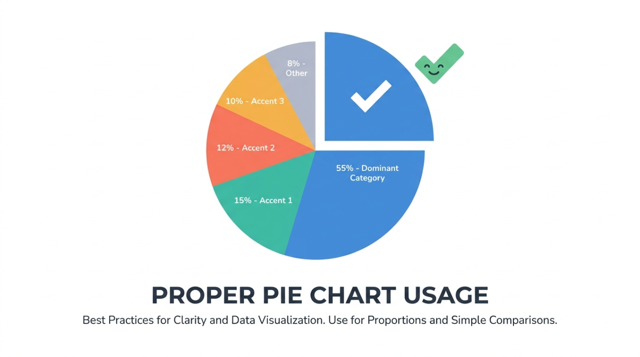
The One Thing Pie Charts Do Well
A pie chart communicates one thing clearly: the size of parts relative to a whole. When a reader sees a pie chart with one slice taking up roughly half the circle, they immediately understand “about half.” This instant perception of proportion is the pie chart’s only advantage over a bar chart, and it’s a real one.
The proportion insight works best with three to five categories where at least one category is notably larger or smaller than the others. A budget breakdown with five departments where one department consumes 45% of the budget is a textbook pie chart use case. The reader grasps the dominance of that slice without reading a single number.
When Pie Charts Fail
Pie charts fail in three specific situations, and these situations are common enough that many analysts avoid pie charts entirely.
First, when the slices are similar in size. Humans are bad at comparing angles. If three slices are 31%, 34%, and 35%, the reader cannot tell which is largest without reading the labels, which defeats the purpose of a visual chart. A bar chart makes these differences obvious.
Second, when there are too many categories. A pie chart with eight or more slices becomes a colorful mess where the small slices collapse into slivers. The rule of thumb is seven categories maximum, and five is the sweet spot.
Third, when the data doesn’t represent parts of a whole. If the categories overlap, if the total doesn’t mean anything, or if you’re comparing across two different totals, a pie chart is technically incorrect. You can’t show this year’s revenue and last year’s revenue as slices of the same pie because they’re not parts of the same whole.
Formatting Rules for Clean Pie Charts
If you’ve determined that a pie chart is the right choice, these formatting decisions make the output readable.
Order slices by size, starting at 12 o’clock and moving clockwise. Most tools default to this, but some tools sort alphabetically, which buries the visual hierarchy.
Use direct labels on the slices rather than a separate legend. A legend forces the reader to look back and forth between the chart and the key. Placing the category name and percentage directly on or next to each slice eliminates that friction.
Use a limited color palette with clearly distinct hues. Five shades of blue that vary only in saturation are hard to distinguish. Pick five colors that a color-blind reader can still differentiate.
Skip the 3D effect. Tilted 3D pie charts distort the perceived size of slices (front slices look larger than back slices) and are widely considered a formatting mistake in data visualization practice.
Tools for Making Pie Charts
Excel and Google Sheets produce functional pie charts, but the defaults need cleanup. The typical workflow involves inserting the chart, removing the legend, adding direct labels, adjusting the rotation, and recoloring the slices, all of which takes several minutes per chart.
An online pie chart generator like ChartGen AI streamlines this. Paste your data, describe the styling you want, and the AI returns a clean chart with proper labels, good colors, and the right rotation. For teams that produce pie charts regularly, the cumulative time savings add up.
The Alternative: Doughnut Charts
Doughnut charts are pie charts with the center removed. They carry the same information but offer a design advantage: the empty center can hold a headline number, a total, or a label. Some designers prefer them because the thinner ring shape feels lighter and more modern than a filled pie.
The analytical properties are identical. If a pie chart is the right choice for your data, a doughnut chart is equally valid.
Conclusion
Pie charts work when you have a small number of categories that represent parts of a meaningful whole and the differences between slices are large enough to see. Outside that narrow use case, a horizontal bar chart sorted by value will almost always communicate more clearly. Know when to use each, and your reports will be better for it.